Challenge
Standard Life was the jewel in the crown of the UK’s largest pensions and savings business, Phoenix Group plc. To support the Group’s growth strategy, they elevated Standard Life – with its 200+ years of heritage and positive customer sentiment – to become the Group Masterbrand. With that came a wider audience and a broader role for Standard Life. They now needed to appeal to policy makers, investors, colleagues and customers.
But there was a problem: while research showed that Standard Life had good brand awareness and was seen by audiences as being ‘reliable’, ‘safe’ and ‘secure’, that wasn’t going to be enough to engage with a younger generation of savers. The brand needed to extend beyond these industry hygiene factors to compete with peers as a more ‘modern’, ‘relevant’ and ‘friendly’ retirement business. A brand revitalisation was critically needed for its success.
Solution
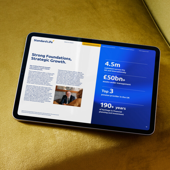
To respond to what its audiences needed, Standard Life developed a new brand positioning as the ‘down-to-earth retirement champion for modern life’. Our role was to express this through its visual and verbal identity. It wasn’t about starting from scratch: there’s valuable equity in Standard Life’s existing look and feel. What was needed was a broader toolkit that could represent the modern, friendly and relevant brand it needed to be. Our first step was to develop a brand personality – one fitting of a retirement champion – to guide our creative direction.
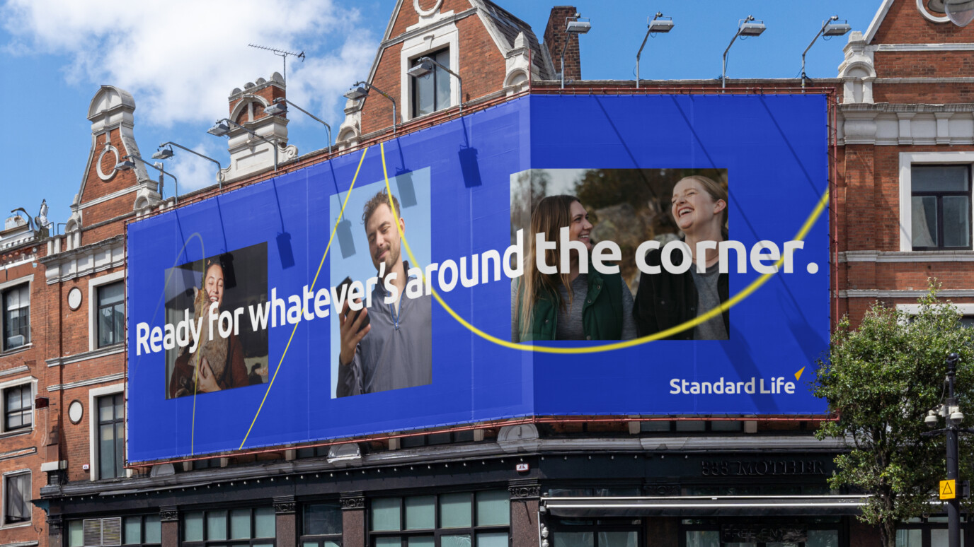
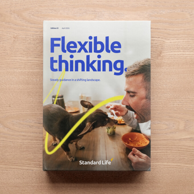
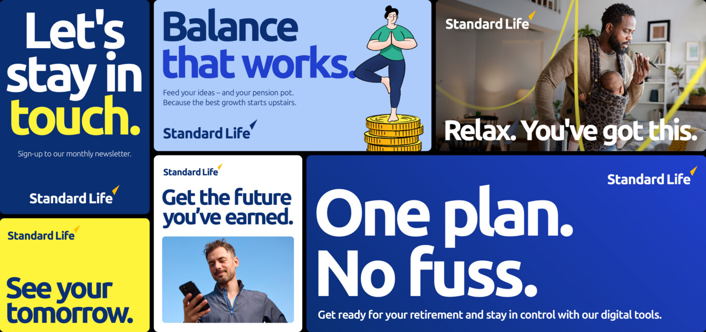
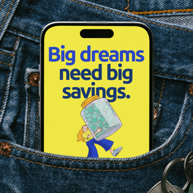
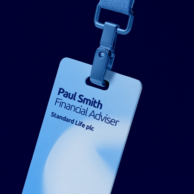
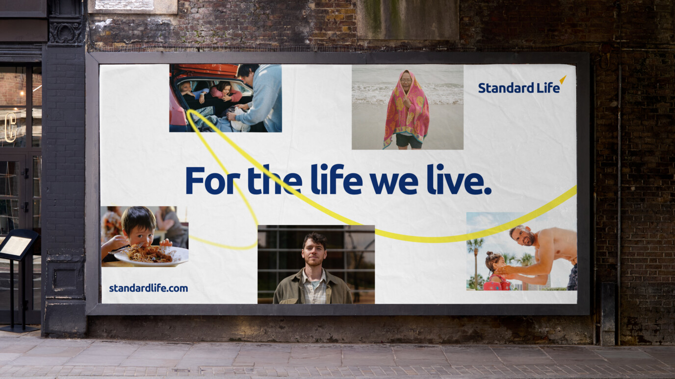
So, where did we land? Our Standard Life is ‘bold’ enough to spark change, ‘optimistic’ about the future and ‘empathetic’ in supporting customers through life’s challenges. These three personality traits informed every creative decision we took in the revitalisation process. While the logo and some essential core equities remained, every component of the visual and verbal identity was rigorously optimised to ensure the brand felt more modern, relevant and friendly.
We developed a new vibrant, digital-first colour palette, a new photography style, a bolder approach to type and new pictograms, illustrations and icons. We also created a new distinctive brand asset: the Journey Line, a hero device that symbolised the ups and downs of everyone’s journey to and through retirement.
Impact
The new brand was launched at the London Stock Exchange to great acclaim. Initial feedback across all audiences has been overwhelmingly positive.
“A brief note to thank you all for your quite brilliant work on our new visual identity for Standard Life this year. I shared where we are with the executive board of Phoenix today. They were quite literally blown away. I am very much looking forward to working with you in 2026 as we bring this all to life.”
– Ben Rhodes, Brand Director, Standard Life plc