Challenge
95 years of campaigns and design codes have given Monoprix a rich visual legacy – one that’s more extensive than most of its competitors. But when you have too many brand signals, none of them speak loudly enough. Our challenge was to identify what aligns with Monoprix’s DNA and leave behind what simply added to the noise, all while honouring its rich heritage.
Solution
Rather than starting from scratch, we went back to Monoprix’s roots – Prisunic, modern art movements, poster design and graphic culture – to distil one defining idea: Monoprix makes everyday life more beautiful.
There were three core convictions that shaped the work:
- Monoprix is not a retailer. It’s a brand with taste: a taste for quality and beauty.
- Monoprix is not just a place. It’s an ‘everything under one roof’ experience, where fashion, home, food and beauty must all speak the same visual language.
- Monoprix is not defined by price. It’s a way of life. ‘Pop’ isn’t a seasonal trend – it’s part of the brand’s DNA.
From there, we built our approach around four principles: amplify rather than soften; simplify rather than accumulate; embrace boldness; unite generations of brand codes.
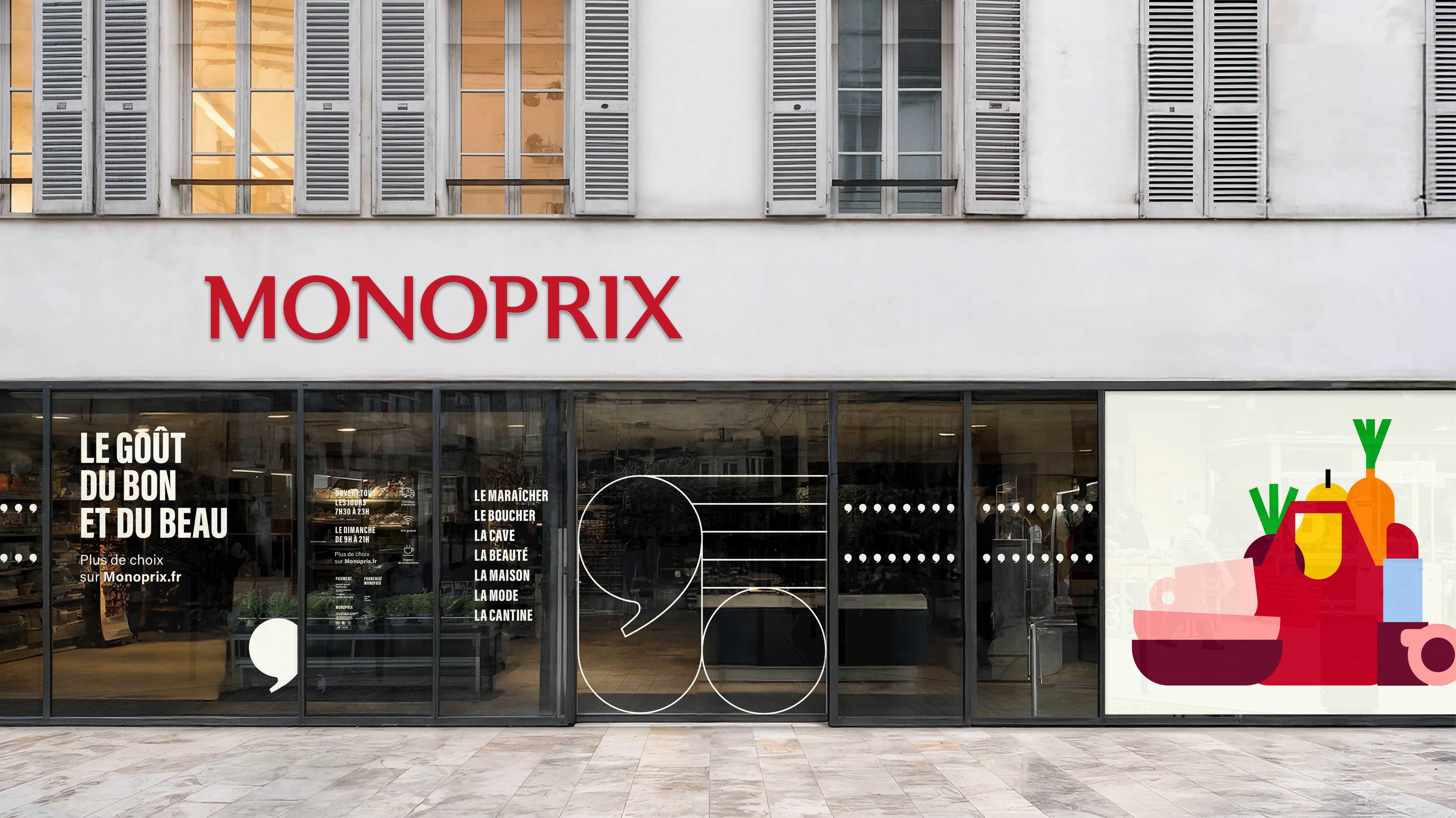
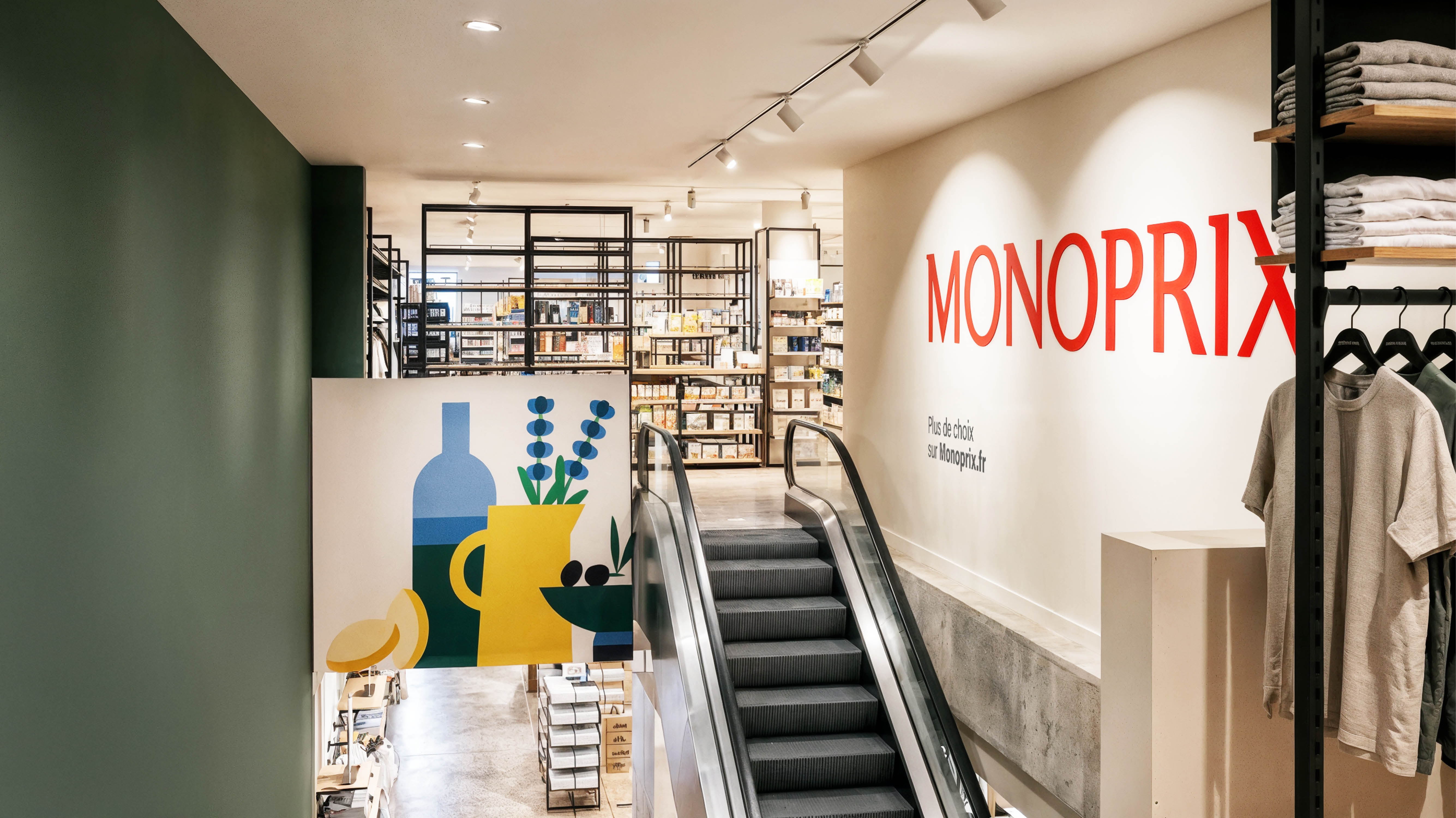
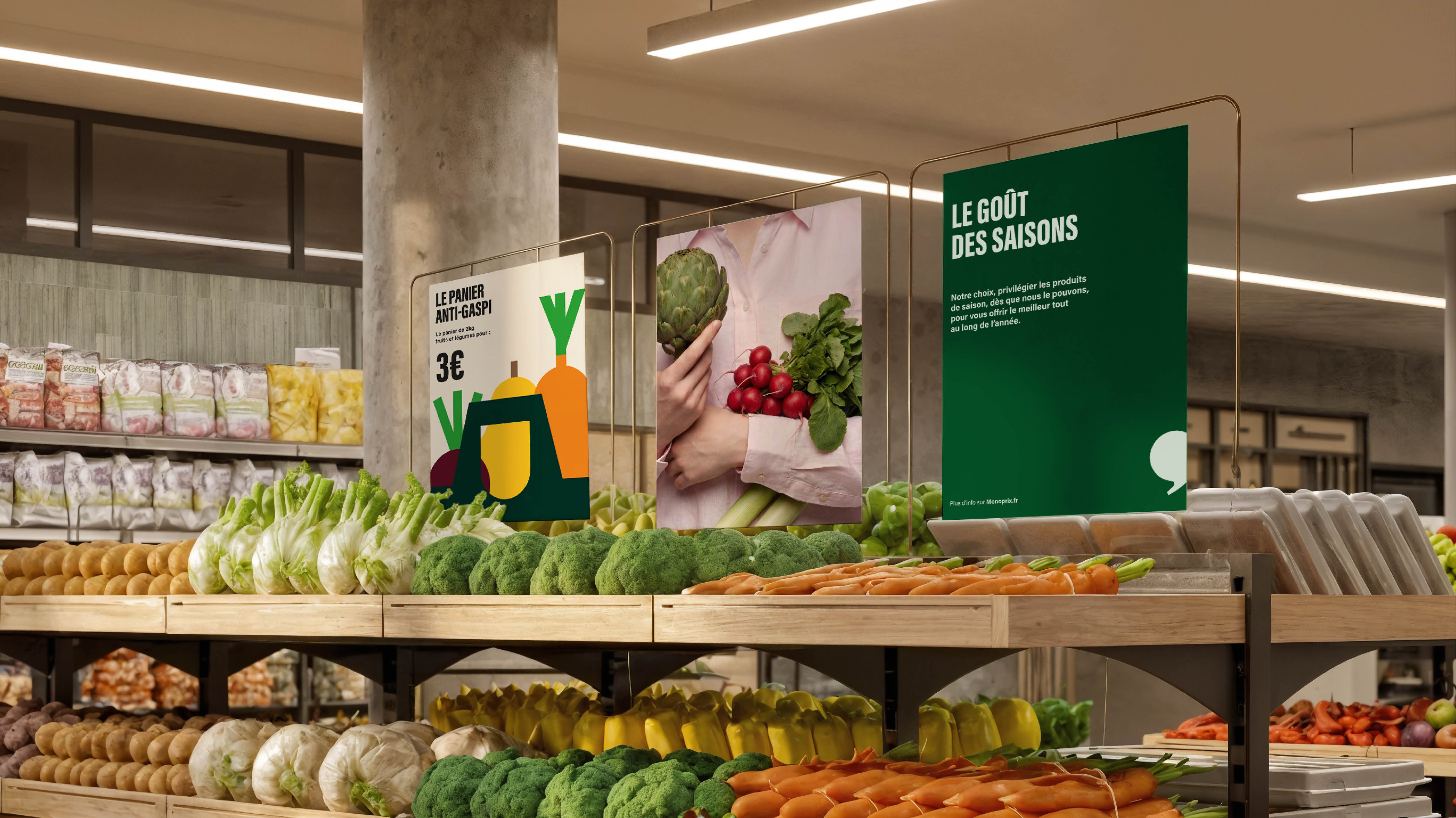
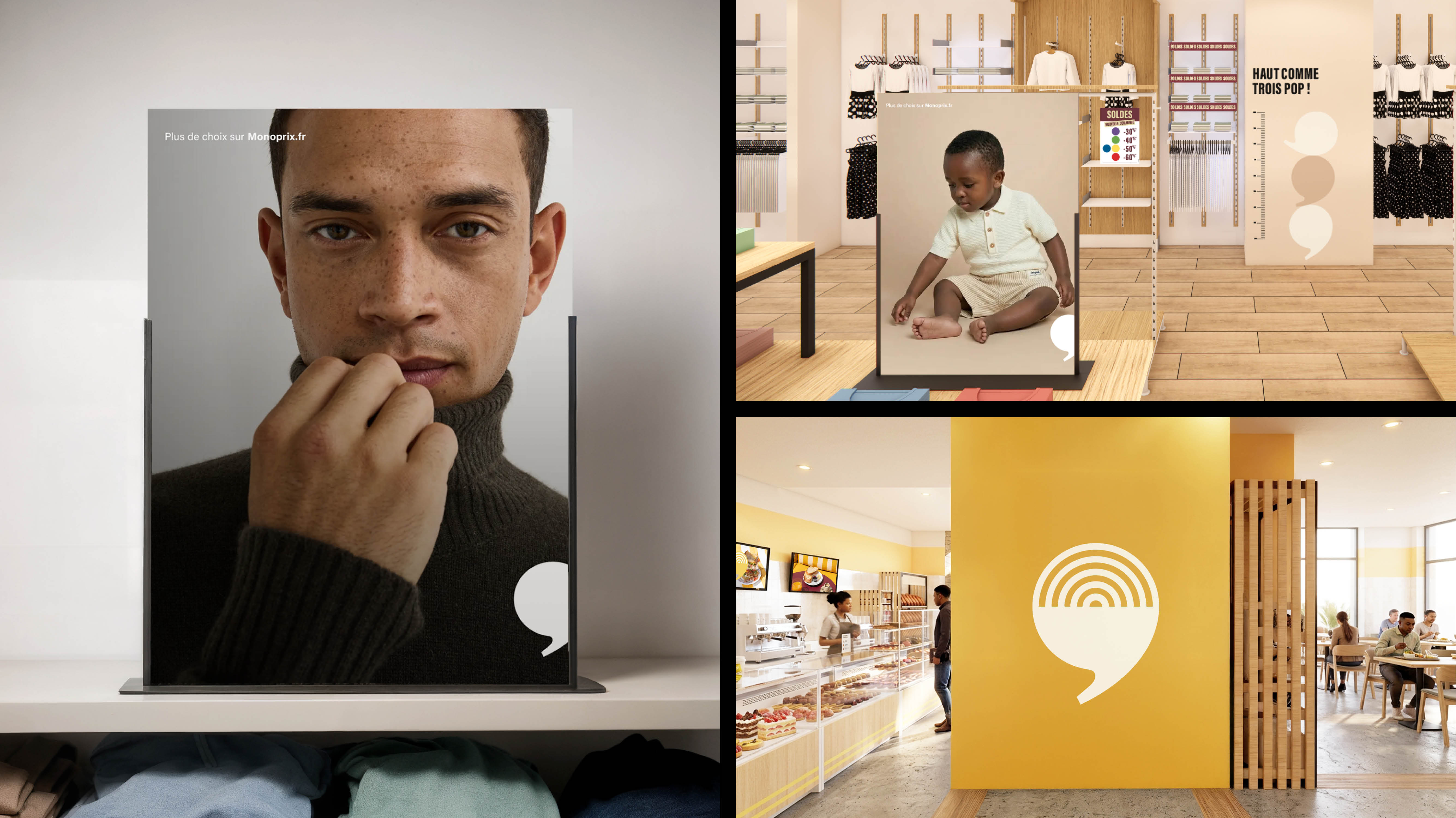
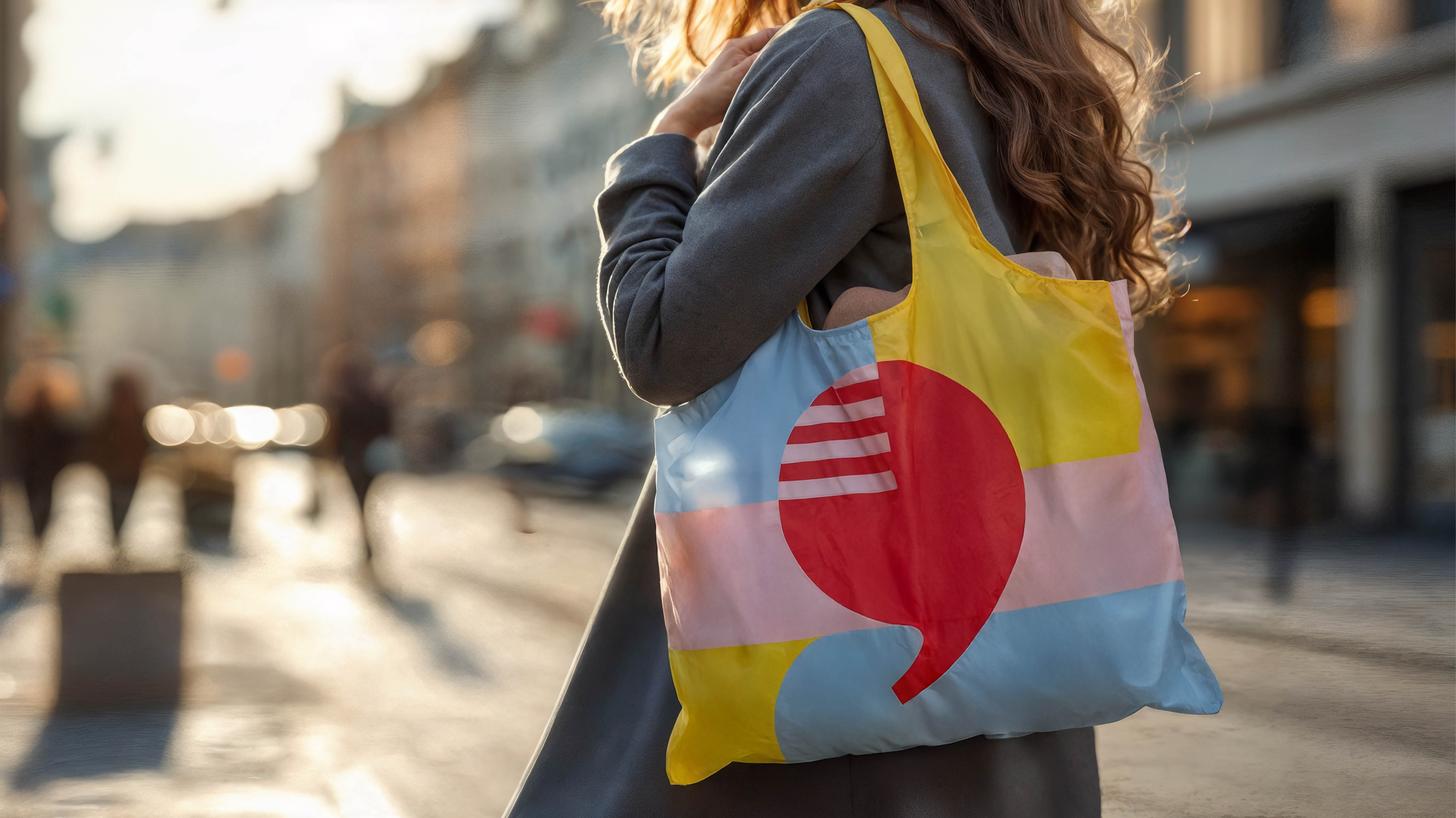
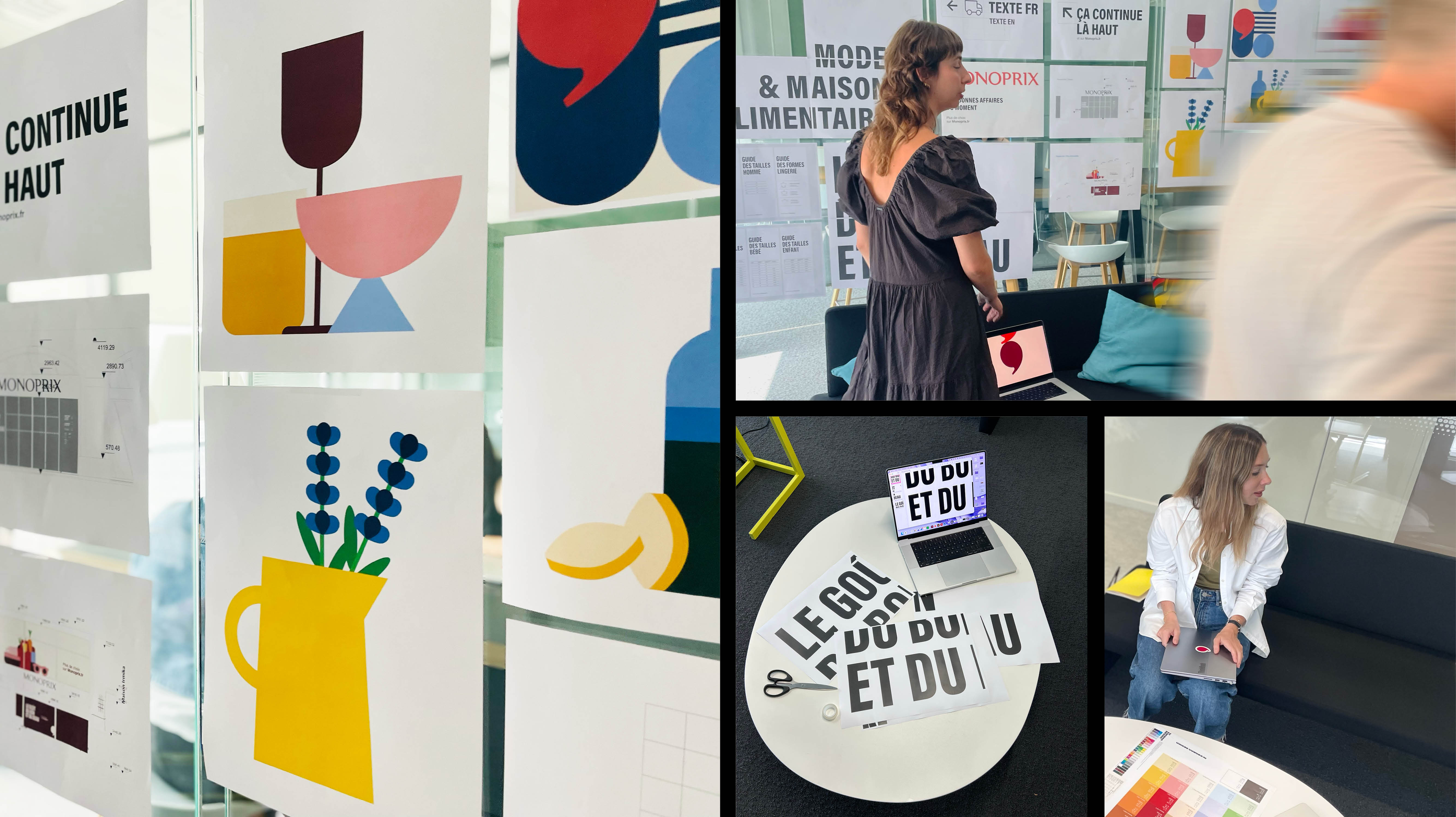
The entire brand system was reimagined from end to end: a refreshed iconic brand marker, proprietary patterns and iconography, original illustrations and a bold colour palette. We created one cohesive visual language, expressed consistently from shopping bags to the app, from shelf to storefront.
Impact
Monoprix has come home to itself. The brand is clearer, more desirable and realigned with its purpose: brightening everyday life by making beauty accessible to everyone.
“The challenge wasn’t to reinvent Monoprix. It was to restore its power.”
— Martin Piot, Vice President, W Conran Design