Thinking.
-

Brand Strategy
Why it’s time for brands to address the connection deficit
-

Digital design
Why accessible digital content should be a priority for every business
-

Reporting
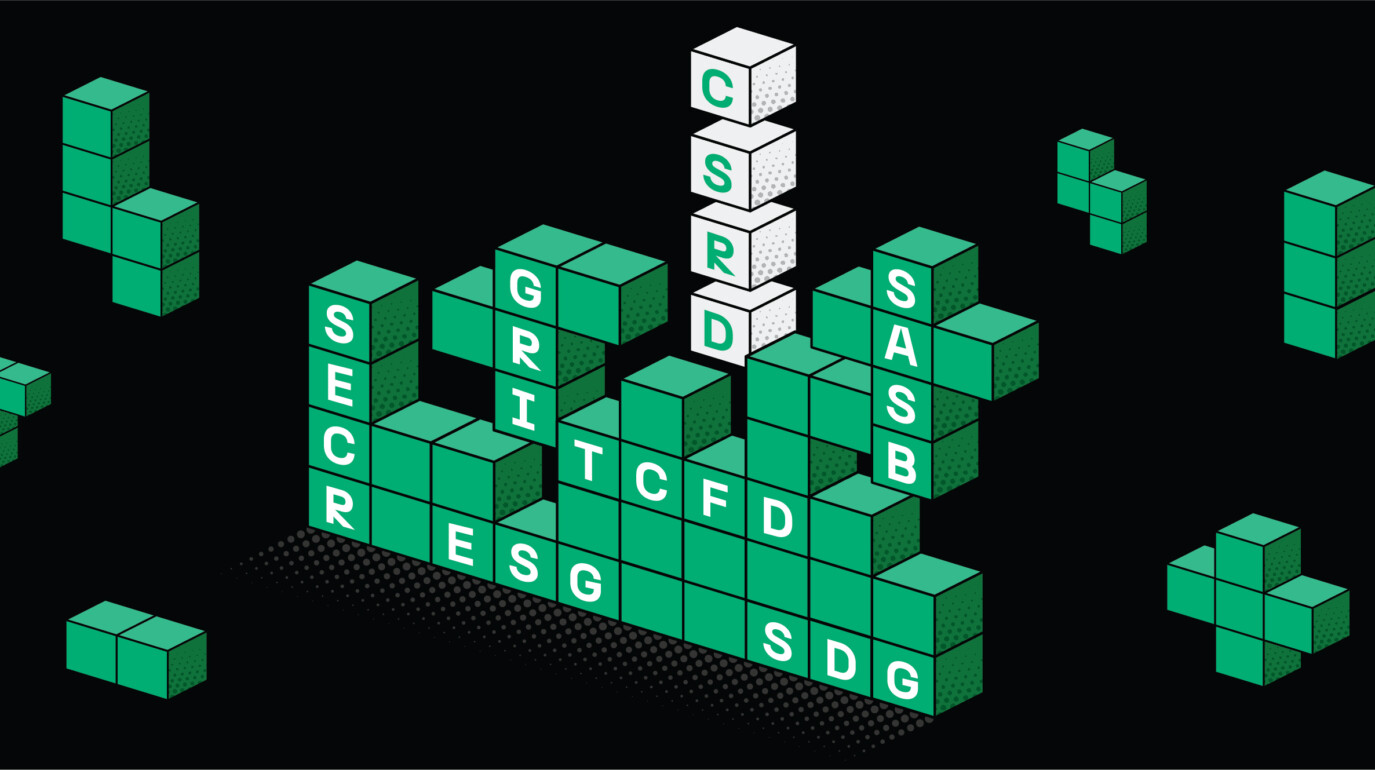
Reporting in 2025: the client services’ perspective
-

Digital design
UX and UI design trends to look out for in 2025
-
Brand Strategy
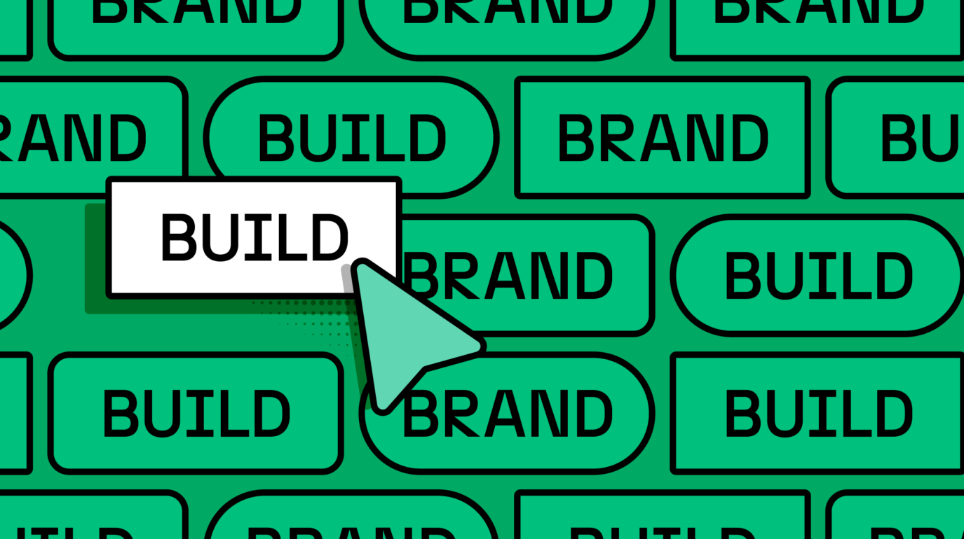
Why brand optimisation is a powerful but overlooked tool
-

Brand Strategy
How luxury brands found their Olympic firepower at Paris 2024
-

Reporting
6 annual reporting design trends for 2025
-
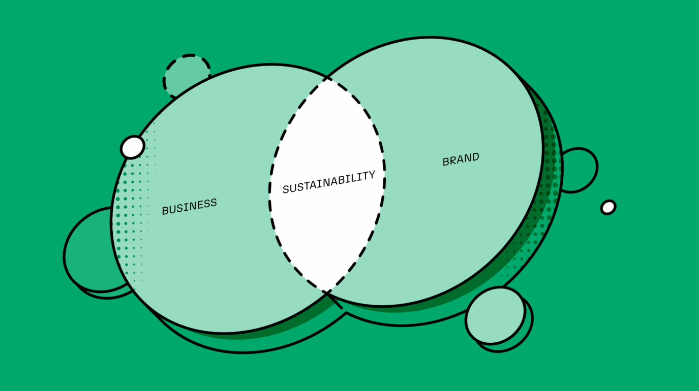
Brand Strategy
How and why we’re integrating sustainability into everything we do
-
Brand Strategy
Why we need to rethink the relationship between corporate and employer brand
-

Brand Design
The case for thoughtful design
-

Brand Strategy
Why now's the time to break convention in consumer healthcare
-
Brand Strategy
3 reasons to prioritise your brand portfolio
-
Reporting
What lives where: solving a perennial reporting challenge


No Result