Challenge
Bank of London has ambitions to become the number one clearing bank in the UK. But after struggling to communicate its unique value proposition and build trust and reliability with stakeholders, it was losing ground to more established players – the likes of Lloyds, HSBC and Barclays.
To drive competitive advantage, Bank of London needed an evolved brand that would reinforce its credibility and authority, and signal to customers that it remains the best banking partner for those seeking corporate banking support.
Solution
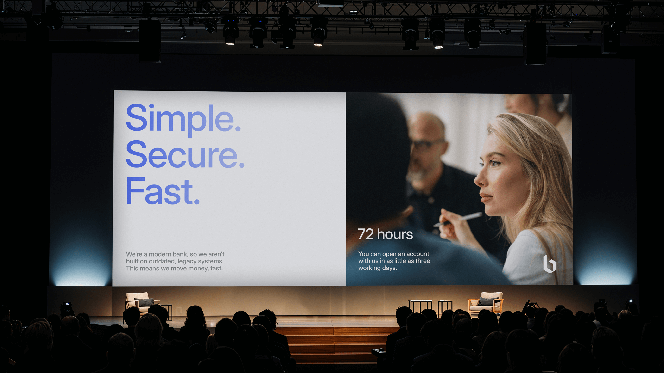
We started by developing a set of values and a new business proposition – We’re rethinking banking to serve business ambition. This highlights the business’ client-centric approach, showcases its ongoing innovation, and captures the entrepreneurial ambition to shape a new banking category.
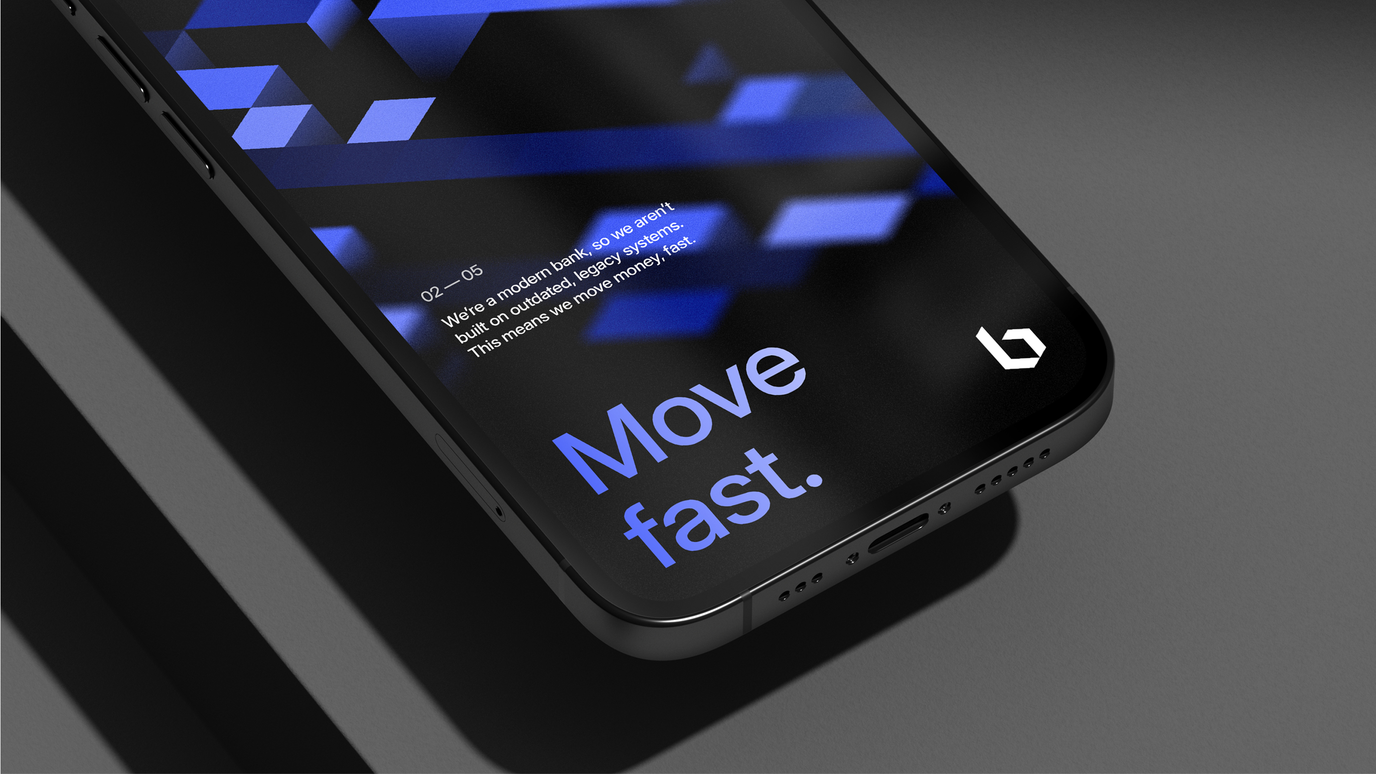
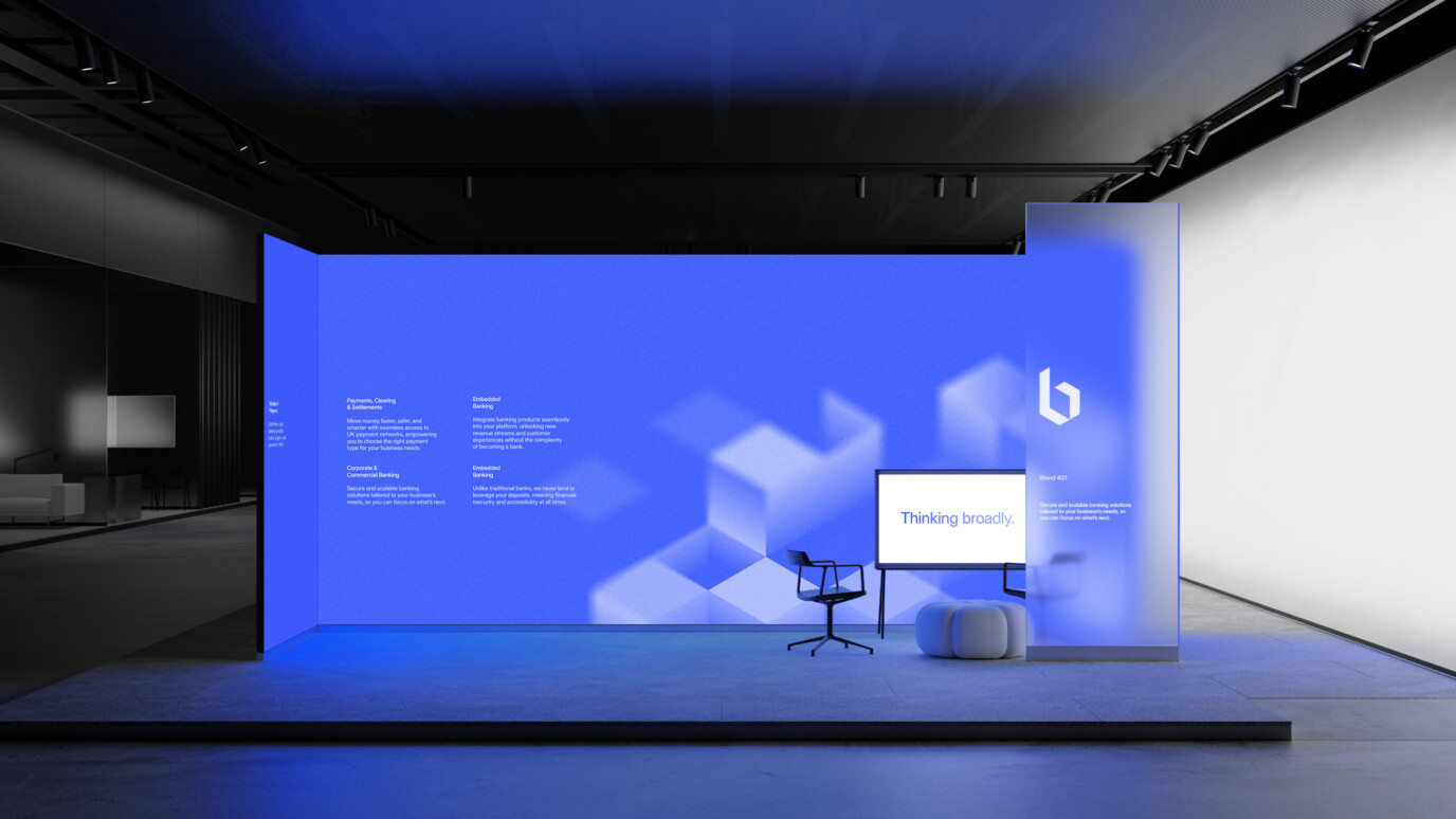
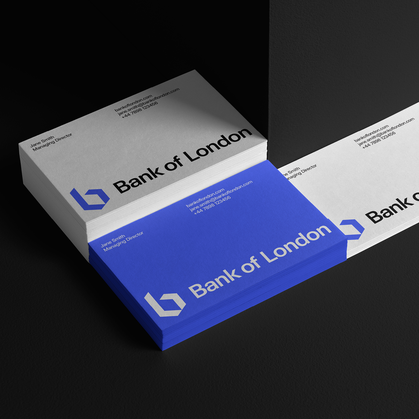
The new visual expression is inspired by the concept of a cornerstone – a metaphor for strength, security and innovation. Drawing on the cornerstone’s geometric form, the new logo uses a cube-shaped isometric grid system; it features the ‘B’ from Bank, the ‘L’ from London, as well as an arrow to symbolise scale and a counter shape to convey security and safety. The lead ‘London Blue’ colour embodies energy and confidence and reflects the bank’s modern tech foundations.
Solution icons were designed using the isometric grid to represent Bank of London’s four main offers: banking as service, corporate banking, deposits, and payments and clearing. These were then built out into 3D forms to add depth and expand the brand’s suite of patterns.
Impact
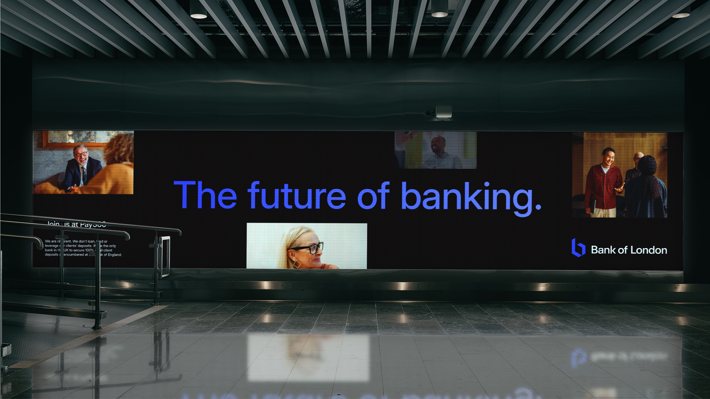
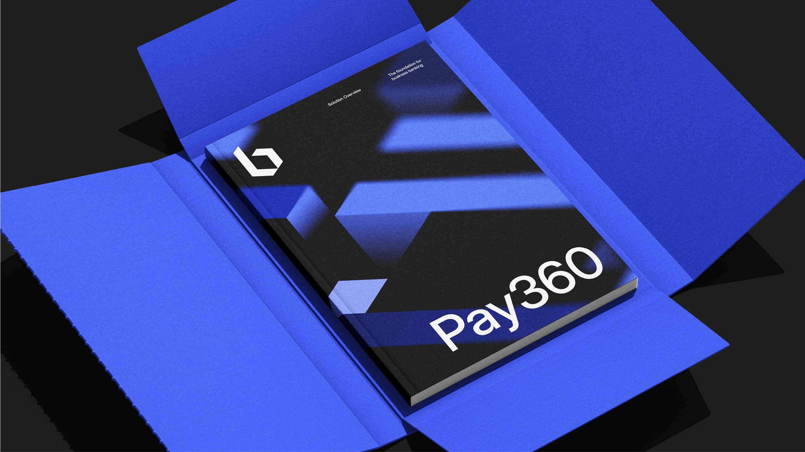
The rebrand was unveiled in person at PAY360, one of the UK’s leading fintech and payments conferences. Throughout the event, the Bank of London team was approached and congratulated on the bold new visual identity and the brand’s innovative direction. Many commented that the refreshed look and positioning felt far more aligned with a modern neo-bank: one aiming to challenge outdated systems and legacy players in finance.
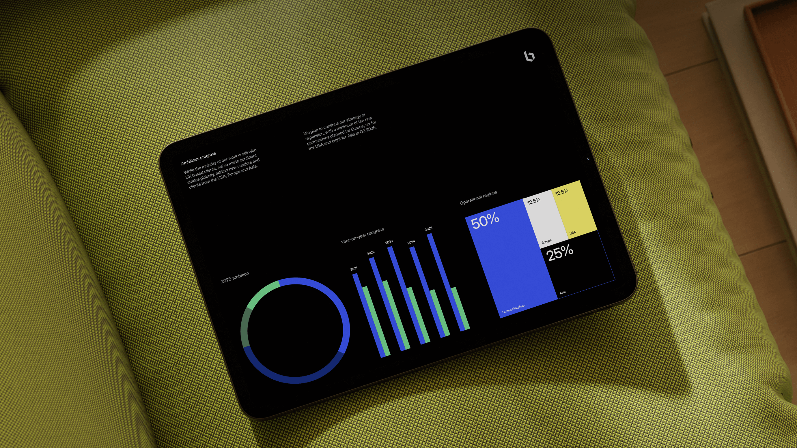
The brand’s LinkedIn following also increased by 41.7% post-launch.
Head of Marketing Alex Noble said: “For a bank with a progressive mission a desire to take on the dominance of heritage brands, the new identity feels like a true reflection of that goal. It not only looks the part, but powerfully supports our purpose of serving modern business needs.”